

AcceleRise is now ToasterLAB, as of today! You can read more about it here. Putting together this new identity has been a steep learning curve for all involved. Name, logo... how did we choose them? Here is an overview of our process with a wise word from the professionals who accompanied us: SoFood and Propulse.
Step one: get your ideas straight
You have an idea, a project, and some founding members: you are ready to start building your brand. Our first piece of advice? Don't rush it! Make sure before you get going that you all share the same vision. The choice of a name, like that of your precious newborn (you: Louise or Charlotte, your spouse: Eléa or Anaé…There's a fight brewing!), choosing a name and a logo will bring out any hidden agendas.
Fanny Basteau, co-founder of the SoFood marketing agency and ToasterLAB mentor, confirms this: "when you define your brand identity, the collective vision plays a very important role. Your team will hang a lot of wieght on a name: strategies, wishes, obstacles... There is also our individual cultures to take into account, or language differences."
This is shared by Ophélie Duthu, of Propulse: "We are working in the area of feelings and reactions. A choice of logo, without neglecting strategic questions, rarely is a rational choice. You like it... or you don't."
So the first step is to have a frank discussion with your team. Write a first creative brief and make sure that you share it, before sending it on to your creative agency.
Step #2 : naming
So, now we can choose a name, with the help of professionals. Finding a name is not child's play.
On a practical level, how does it work?
"Before really getting into the creative stage, we start by generating ideas," explains Fanny Basteau. "It's mainly a brainstorming stage, using the client brief, according to several techniques: idea and word associations, colours, mythological references, lexical fields..."
200 ideas from your brainstorming, how to choose? Don't stress yet, as there is an "approval" filter that will drastically reduce the list: availability for IP protection, web domains and social media accounts. "In general, around 3/4 of the ideas are sidelined during this step."
The next stage is the proper creative process, taking anything from 4 hours to a full time week. Fanny warns us, "creativity is not synonymous with anything goes. You need to take into account the dimensions of the target market (regional, national, international) as well as questions of ease of protection and of course, the obvious question of ease of pronunciation."
"For ToasterLAB, we chose a play on the concept of toaster - it's visuel side (startups are "projected" upwards), the link to food (toaster) and the 'technical' (a toaster, after all, is an electrical appliance), but also juxtaposition of the friendly, familiar toaster with the more serious nature of 'lab'. And a name that would lend itself well to an international deployment thanks to its English roots."
step #3 : the logo
Once the name is chosen, its time to move on to the logo, starting with 'roughs'. "We started with pencil sketches, as this medium has no technical limitations and is fast to produce", explains Ophélie Duthi of Propulse.
As the client, we there then asked for feedback... on which we were pretty vocal. This stage is often called by creatives the "martyr" project stage. "We need feedback, even if the reactions are unfiltered. This lets us refine the creative vision," she explains. "The logo is about emotions and reactions. We can't translate that from a brief. As professionals, we need to be very tuned to this feedback."
From then, we moved onto colorisation and digital rendition. "The technical constraints of a logo play a key role. It needs to be attractive and to appeal to clients. It must also be usable in all formats from a small size in the corner of a poster to a web page, in colour and black and white etc. This is a very pragmatic process."
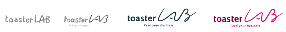
The logo retained for ToasterLAB went through a number of exchanges and stages: "We volontarily chose a contrast between the two components. The choice of font for "toaster" gives it a structered side while also being approachable thanks to the lowercase letters. However, "lab" counterbalances the serious side with a freestyle, handwritten look. The lines and curves give an upwards dynamic like that of an accelerated startup:"
You can find at the top of the page a visuel look at the iconography of the elements of the logo.
step #4: approve and launch!
"The real challenge, when you launch a brand, is for it to be accepted by your clients," claims Fanny Basteau, "especially in the case of a rebrand."
"Even if a name has no real value, it is difficult to get people to let go of a concept that they have become familiar with."
Challenge accepted: let's get ToasterLAB out there!
And you, what is your brand creation story? Hoever, my two cents... if you are still in the process of building, I advise you to get professional help. It will pay of in the long run.
You might also be interested in:
By Christophe Breuillet

Managing director of Vitagora and ToasterLAB, Christophe is the big boss! His various areas of expertise cover innovation and food business development, internationalisation and influence strategies… basically Food “Business” with a capital B! You can contact him at: christophe.breuillet@vitagora.com